In the previous part we had a look at how to setup your WordPress blog on HostGator. Adding the basic settings and plugins to it and making it ready for your first post. With all the technical stuff behind us, and the blog finally in place, it's time to dive into your blog.
From this section onwards we will be looking at different aspects of your blog, how to design its layout, basic pages to add to your blog, how to design your content, monetization options for your blog, branding your blog and much more. Its time to start working on your blog. So lets get going!
In this part we will be looking at the different components that make up your blog’s layout and structure. We will understand how you need to place or use the component in order to maximize its effectiveness. Layout of your blog is akin to building a framework for any object. Only if the framework is right, will the object be able to function smoothly.
What you will Learn:
- Comment box Placement
- Author Bio box
- Read More box
- Post Date
- Images
- Contact Form Placement
- Header
- Navigation Bar
- Font Selection
- Content Layout
- Social Sharing Buttons
- Empty Spaces
- Formatting text
- Lining up your blog
- Profile Photo
- Search Bar
- Sidebar
- Adding Elements/Widgets to your blog
- Color selection
- Branding Consistency
- Mobile & Tablet Responsiveness
- Conclusion
So lets get started.
21 Important Elements of every Succesful blog
Blog layout is made of lot of different components, some small some big, but put together they all make the basic structure of your blog. Here we will be looking at the commonly used components, how best to design and place them to maximize their effectiveness for your blog.
1. Comments Section – Usually every blog includes a comments section, which is at the end of the post. It encourages interaction with audience, and helps add free fresh content to your blog. Most bloggers prefer to let the comments show as it is. You can also opt for your comment section to be hidden, which will be displayed when the readers click on hyperlink marked – ‘Comments/ Read Comments/ Add your comment, etc'. This strategy is usually not recommended as reader might miss the hyperlink and assume that your blog does not include a comments section. Unless it's a norm in your niche, or you are averse to talking to people, always add a comments section to your blog. However to maximize the benefit of the blog section make sure you are active in responding to audience query and comments. This encourages readers to interact with you and convert into loyal followers of your blog.
2. Read More/Also Read/ Further Reading – This section contains suggestion to encourage your readers to read more article on your blog. Always add this section. A reader who has reached till the end of your post, is engaged and interested; if guided he/she will be keen on reading more of your posts. Generally it is best to include related post in this section. In case you do not have any related post, you can include your most popular post here. In case of series post, you can include the preceding and succeeding article links here. Add this box below the author bio box at end of the post. Keep it above the comments section. In case your comment section will be hidden with a hyperlink, then you can add this box below the comments section if required. But wait, if your aim is to get subscribers to your blog, then place your subscription box here instead of the read more box. However you can combine all 3 together also. Have a look at how smartly Derek Halpern of Social Triggers has combined all the 3 elements on his blog.
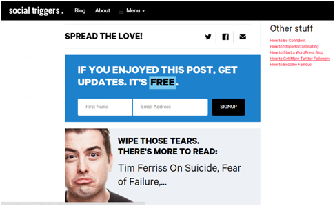
There is a sleek social sharing bar, followed by a clean and crisp subscription form, and finally he has added the ‘what to read next’ box on the bottom with his photo which adds a fun element to the box. Also notice on the right sidebar you can see a section ‘Other stuff’ which contains 5 most popular posts of his blog.
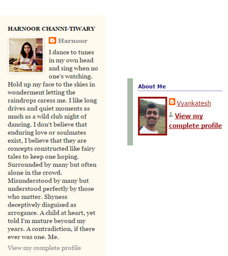
3. About Me/ Author Bio – You can add a short author bio which will feature throughout your blog. Detailed bio can be added on the About me page. This short bio can either be displayed in the sidebar, or under the post. If displayed in sidebar it is usually added as either the 1st or 2nd element in the sidebar. If you want to display your bio under your post, then add the bio box right after the post ends. Do not add it after comments section or read more section. Always add your profile photo to the author bio box. People are more keen on interaction when they can associate author name with a face. Keep the bio short and crisp.
Here are two bio examples. One a little too long another a little too short. Find right balance between the two for your bio box.
4. Post Date – Unless your blog is in a niche where dates don't matter, always include post date. And frankly dates matter in all niches. Date makes your blog look active as reader can track how frequently you post. They also give readers an idea of when you published this particular post, and hence if it is relevant in the current times. In case you update any old post with new content, to keep it current – Add the detail about when the post was updated in the content or the heading of the post. I do not recommend changing the date of your original post.
5. Images – Images add a visual element to your blog post, and this works great if done right. Add a image that enhances the post, and is relevant to it. If you do not own the image, always give credit to the image source. Ensure all the images you use are copyright safe. Optimize the images, since they increase page load time. In the previous section about ‘Plugins your blog needs' we have seen plugins to specifically optimize images. You can either this to your blog, or manually optimize your images. In case of images you own, consider adding your logo to the images, in an inconspicuous manner. You can also add images in form of infographics, presenting the important points of your article visually. Here’s a good example of using logo in images by Anna Hoffman at Traffic Generation Cafe
![]()
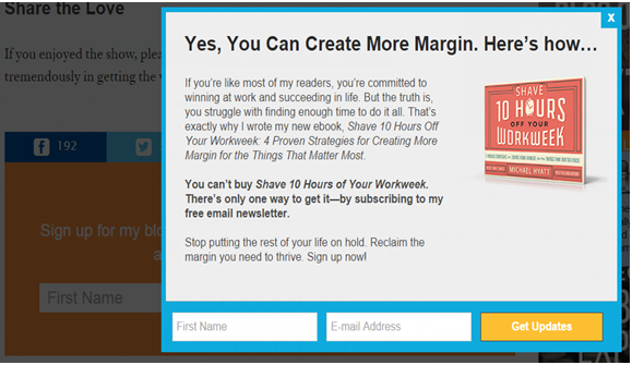
6. Contact/ Subscription Forms – Make them stand out and easy to locate. You need readers to fill in this form, so make it visible and attention grabbing. Do not go overboard however, or it will distract from your content. I will be covering subscription form placement in detail in the section about ‘How to build your Email list'. In case you are using your blog to promote your services, contact form is a critical element of your blog. It needs to be prominent, and easy to fill. In this case place your contact form above the fold in your blog, and you can even look into adding a contact button in form of sticky widget which will follow readers as they scroll down your blog. Most bloggers like this one below by Michael Hyatt uses atleast 2-3 subscription forms.
A form at the beginning of the post, placed in the right sidebar
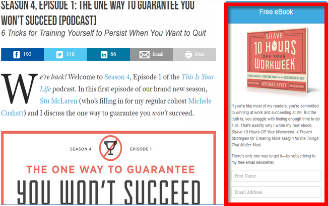
One form at end of the post, and another to be shown when you are exiting the site.
7. Header – Make it look amazing. This is the first thing visitors see when they reach your blog. Design it with care. Make sure to include your logo in this. Some other stuff you can add to your header are – awards your blog has received, a search bar, whatever you can use to impress your audience. In case you want to opt for cleaner look, you can integrate your navigation bar with header. Make sure that the font you use in Header is coordinated with your blog content font. Many bloggers use minimalistic headers wherein they only add their logo and keep the space uncluttered. However you choose to design your header, make it impactful.
Two well executed headers from leading blogs, you can opt for either of these looks or do something totally different. Choice is yours.
8. Search Bar – Add a search bar to your blog. As your blog expands search bar will help your users navigate around your blog. Make the search bar prominent. Making it easier for readers to search and browse through your blog will make them happier, and more likely to become a return visitor.
9. Navigation Bar – Navigation bar is a must for every blog. This allows you to organise and present your content in a better manner. This also aids your viewers in understanding how is your content organized and makes it easy for them to navigate around our blog. As a thumb rule your navigation bar should contain not more than 5-8 headings. These headings represents the broad areas into which your blog content can be divided. For example a Motorbike blog – Visor down has 10 headings in its navigation bar, its a tad crowded, but still works well for them.
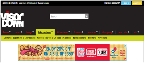
Each heading then brings in a sleek drop down menu containing sub-headings. As opposed to traditional drop down menu where the sub-headings are stacked vertically over one another, here the headings are stacked horizontally. This horizontal stacking is refreshing change, easier to read as your eyes scroll from left to right in a single row, and most importantly allows Visordown to utilize the space underneath to display Adsense ads
10. Font & Font Sizes – Pay attention to your – Font, font size, spacing between letters, line height. Ensure your font size is appropriate, too big or too small either are not good. Do not go under 16pt, on the higher side, you can use fonts as required to create impact. Use popular fonts to ensure compatibility with all browsers as well as mobile platforms. Sans-Serif is the most popular font, because of its ease in readability. Keep minimum of 1.0 spacing between lines, use 1.5-2.0 spacing between points, headings etc.
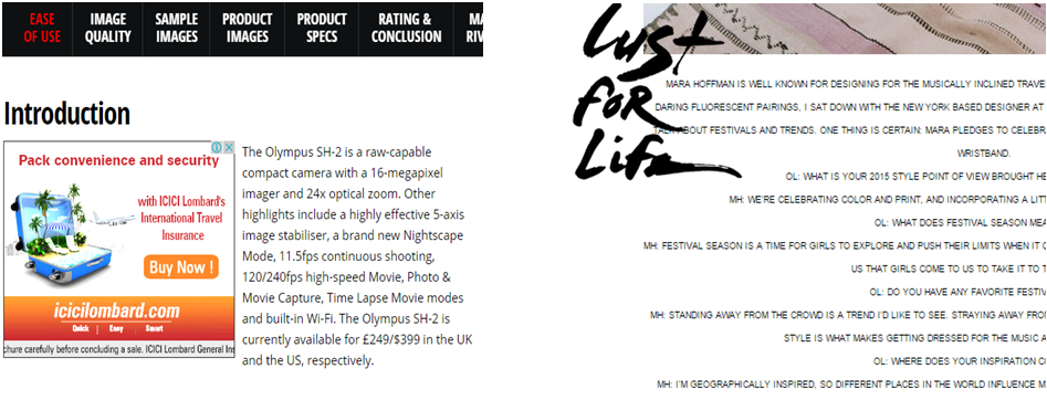
Below are two sample of texts, one the left is text from a photography blog, which is crisp and easy to read. On the right side is text from a Fashion blog, which is in all caps, slightly difficult to read. Not the text work well for the respective audiences. Hence you need to study your niche and understand what works for your audience.
Here’s a look at the opening of 3 different articles from same blog, which one are you likely to read?
13. Social Sharing Button – You can either add individual buttons or a integrated social sharing bar. Placement of the bar is crucial, in order to encourage people to share the content. Test what works best for your blog. Floating social bar are the current trend, since unlike traditional bar/button which stay fixed in a place these bar keep moving as the reader scrolls down the content. However some bloggers have found these bar hinder their readers experience and cause negative impact on the social sharing. Test out different types of social sharing button as well as their different placement to know what works best for you.
Marc Andre at profitblitz.com has 3 social sharing bars going on for his blog. A bar at the beginning of the post, a floating bar that stays with you as you scroll down the content and another static bar at the end of the post. And it seems to be working well for Marc. So you will need to experiment and find which combination and how many social buttons are optimum for your blog.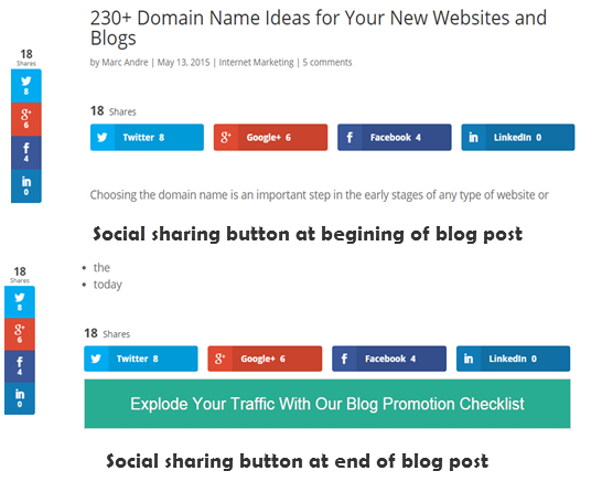
14. Formatting – Use Capital, Italics, Underline and All Cap at appropriate places. Do not overuse any feature, this will detract from its purpose of drawing attention. Unless essential do not use All cap, as it is considered to be rude, akin to yelling at others. Italics make for difficult reading, so use them sparingly. Keep paragraphs short, and easy to assimilate. Longer essay like paragraphs are unsuitable for online reading.
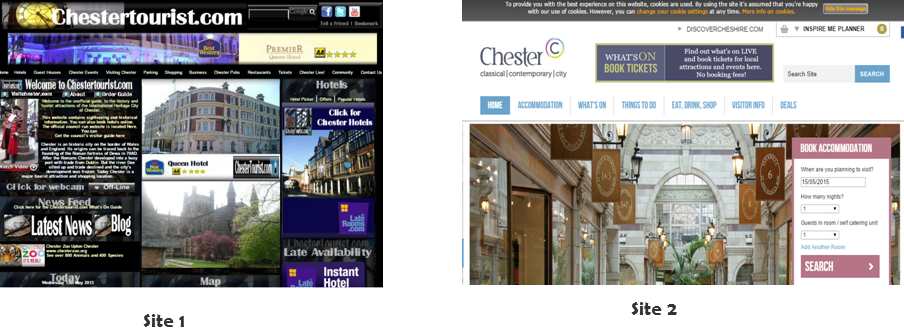
15. Empty Spaces – These are very important element in any blog layout. CREATE EMPTY SPACES. This enables readers to rest eyes between reading, thus making it easier for them to read through your blog. Also empty spaces create a feeling of spaciness which encourages readers to read further. Be strategic in the placement of your empty spaces, spread them across a blog and post too.
Lets have a look at 2 websites side by side. In one you notice the cramped design with so much going on that you cannot decide where to focus. In other website you can notice lot of white space in the header, and a relatively simple above the fold design with focus on the form which has been placed on right side of the screen. By using white spaces, 2nd website has created focus area and viewers know what to do next. In 1st website the busy design will deter most viewers from browsing the website further.
16. Keep it Lined up – Keep your blog text lined up in one or 2 column format. Usually if using sidebar 1 column format works well. In case you are not using any sidebar checkout the 2 column format similar to that used in newspaper. This lends a neat look to your blog. Also since the column constrains your text, it makes it easier for readers to read longer post. Make sure your images/videos etc, all elements in the post are lined up. This allows for easier eye movement and also maintains the flow of the post.
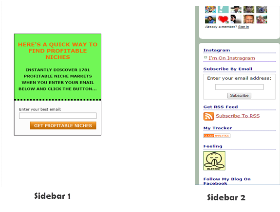
17. Sidebar – Do not clutter your sidebar with too many elements, Keep it well organized, neat and clean. Elements that can be added to a sidebar are – About snapshot, Latest post list, Search bar, Contact/Subscription form, category list , etc. Choose your element with care. Unless it is absolutely essential do not add it to the sidebar. Well planned sidebar lends look of spaciousness and enhances the blog functionality, both at same time.
Which of these two Sidebar will convert better?
18. Elements/Widgets – Do not add too many elements to your blog. If adding a social media stream, choose the one which you want to highlight and add a stream for the same. Do not overcrowd with all media streams. Similarly if you want to add a social sharing bar/button choose one and add that. Blogs with social sharing buttons crowding all corner suffocate readers, and are less likely to be shared than those with fewer well placed sharing bar.
19. Color – Most widely used color combination is black text against white background. However do you know that this is not the ideal combination? Computer & mobile screen both are prone to excessive glare making reading long article on either a difficult task. White background compounds this glare problem, thus making your reader's eye tired even sooner. Colors like light grey, pale green, buttercup yellow which have soft hue work very well for background. Choose a font color which, contrasts well with your background. Stronger the contrast better it is for readers. Pick up colors from one palette, so that they work well together. Pick up between 3-4 colors to format your blog text and other elements. Too many colors spoil the look. Too few might lend a bland feel to your blog. Neil Patel has done a great article on How to chose color to maximize conversion rate, give it a read to make informed choices about your blog color.
20. Branding Consistency – Check the final layout of your blog, for branding consistency. Color scheme should be in line with your logo colors. Font usage should be consistent and easy to read. Blog should reflect brand personality. A fashion blog, can use more fancy and cursive writing with flowery language ets. A Internet Marketing blog needs to use more business like font in order to reflect the correct brand personality.
21. Mobile & Tablet Responsiveness – Ensure your blog design is mobile and tablet responsive. Mobile users are increasing, to tap into this market it is essential that your website looks right on mobiles and tablets. Mobile responsive sites resize themselves automatically to fit in the screen size. This helps in maintaining quality when rendering your blog on mobiles & tablets. Google Mobile update on 21st April makes it essential that your blog is mobile friendly. Use this nifty Google tool to check how mobile freindly is your blog – https://www.google.com/webmasters/tools/mobile-friendly/
Conclusion:
We have covered lot of blog elements here. With each element it is important to experiment and check what works best for your blog, test out different options of each element and then choose the best. If you have to test everything what's the point of this post???
This post is meant to guide you in deciding which option to work with. In case of some element like Sidebar, we know what works best for almost all blogs. So you can choose to follow the popular trend in case of these elements. While in some other cases like colors and formatting, you need to experiment and see what works best for you.
So what are you waiting for get experimenting. Start with smaller elements like font and move on to larger elements like headers. Find the best combo for your blog.
In the next part we will be looking at pages every blog needs. We will look at the different pages that every blog needs to include and some basic guidelines about what to include in each of these pages. From the most common page – about me to the lesser used – Advertise with us page we will be looking at the whole gambit.
More from my blog